Case study · Brand identity and website · 2025
TEDxMITWPU 2025: brand identity and website
I led the visual identity for the 2nd edition of TEDxMITWPU, and co-designed the event website that sold 100+ of 192 tickets within 72 hours of launch.
- Role
- Lead graphic designer
- Team
- Design team of 5–6; website co-designed with one other designer
- Timeline
- Design approved in under 17 days; site live in about 45
- Tools
- Figma, Illustrator, Photoshop, Canva, Krita (pen tablet)
The problem
The first edition had done well, but its look was simple and minimal. For the 2nd edition, the team was given one theme, “Threads of Identity”, and two goals: make the event visible across campus so tickets sell, and present the speakers clearly. The design had to explain an abstract theme fast enough that a student would understand it, connect with it and register.
Why it matters
Tickets had to sell before the event, so the website's first screen had one job: turn a curious visitor into a registration. A theme people don't understand is a theme they don't buy a ticket for.
Process
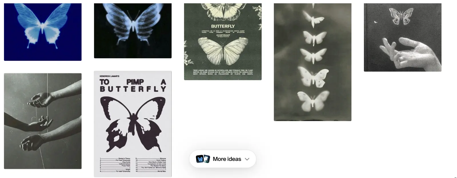
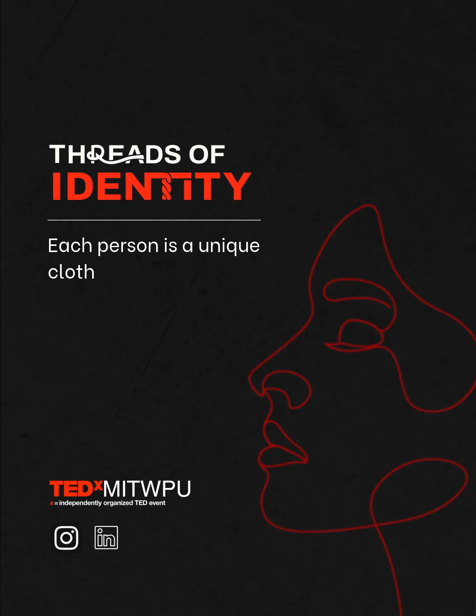
- Research and moodboards. I collected references on Pinterest to find a visual language for identity: hands, threads, butterflies and x-ray textures.
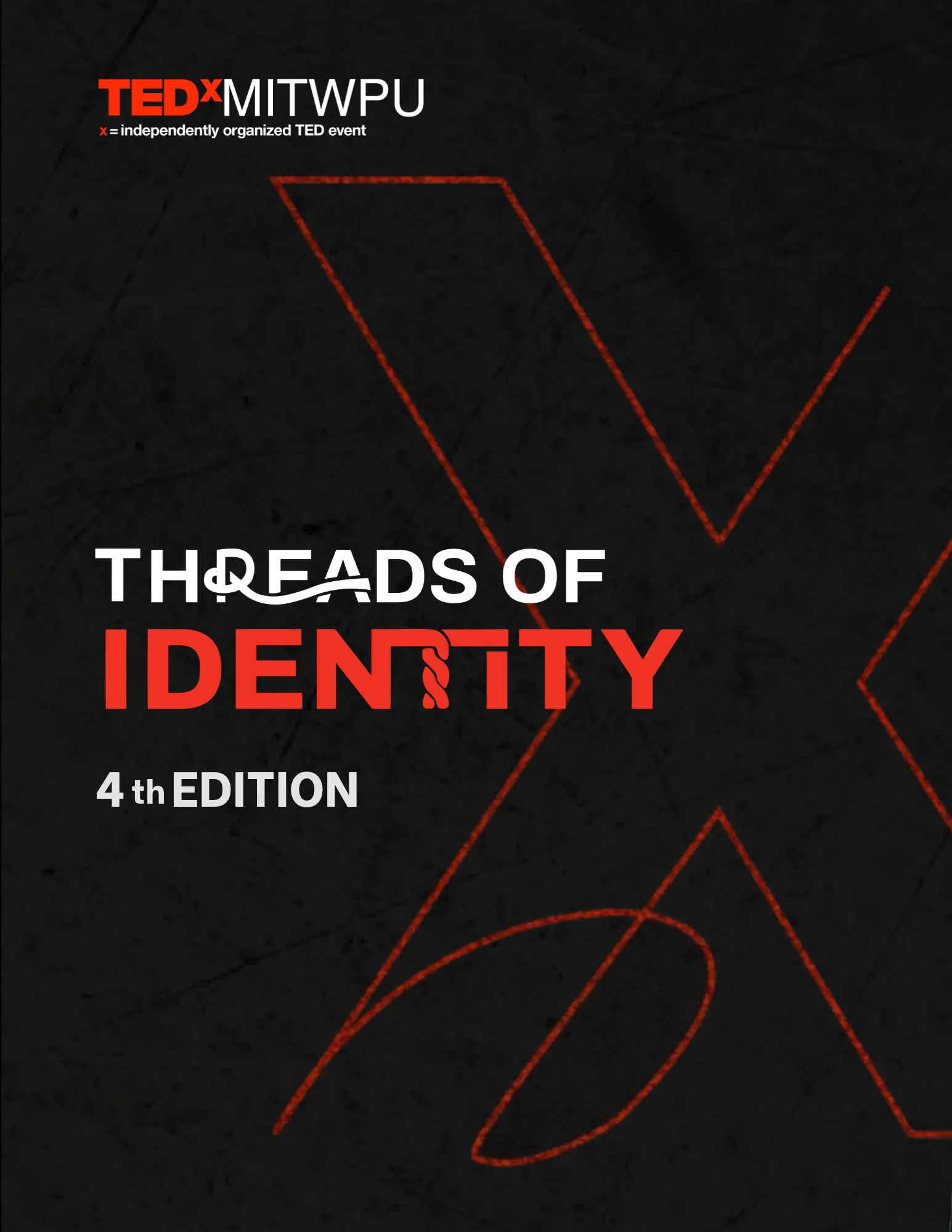
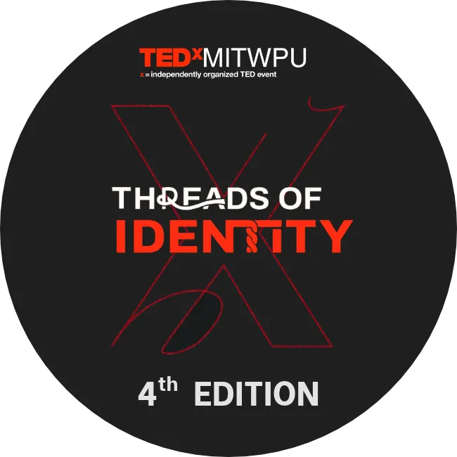
- Working inside TEDx rules. TEDx brand guidelines allow only the official red, black and white. Instead of fighting that, I used it: black for depth, red for the threads that connect people.
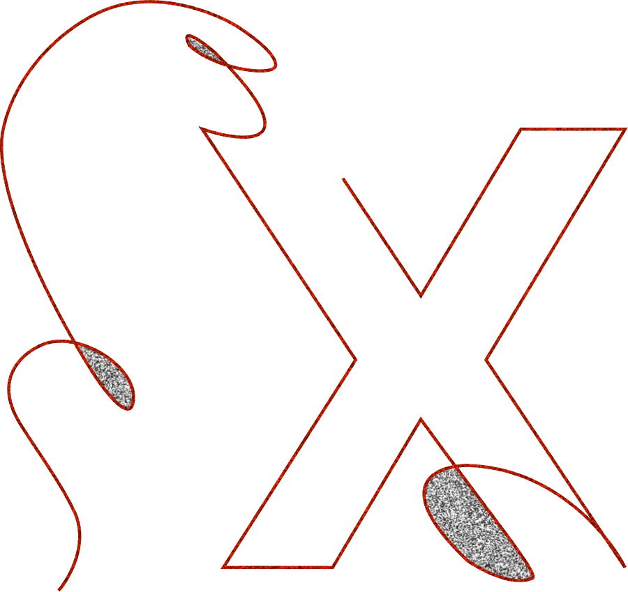
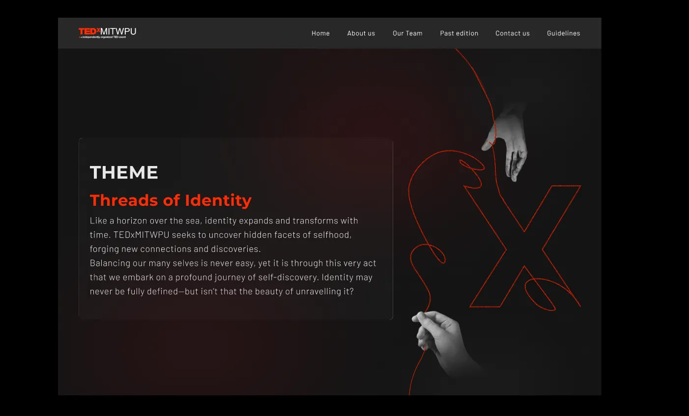
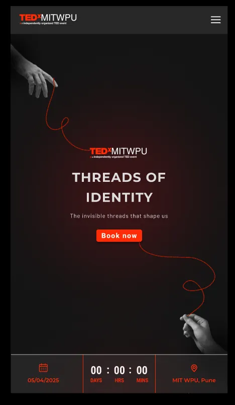
- The X mark. I drew a custom X by hand on a pen tablet in Krita, along with the thread illustrations that run across the pages. The team liked it enough that it became the core brand element across everything.
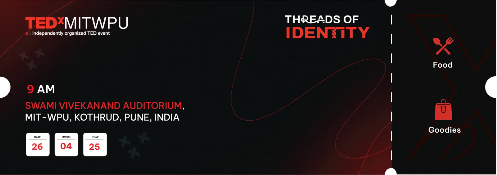
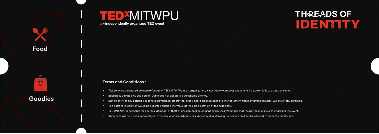
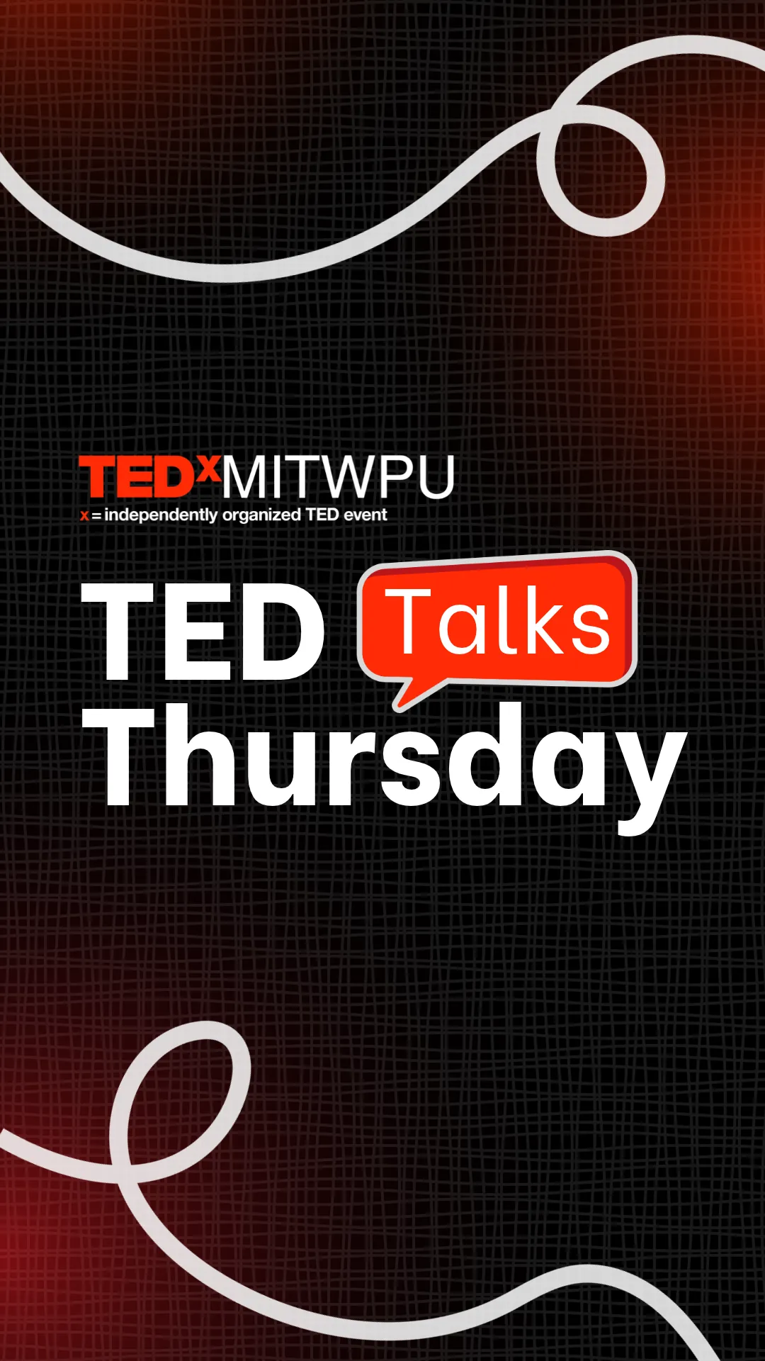
- Brand system. I carried the X and the threads across tickets, a diary, badges and stickers, lanyards, social posts and the sponsor deck.
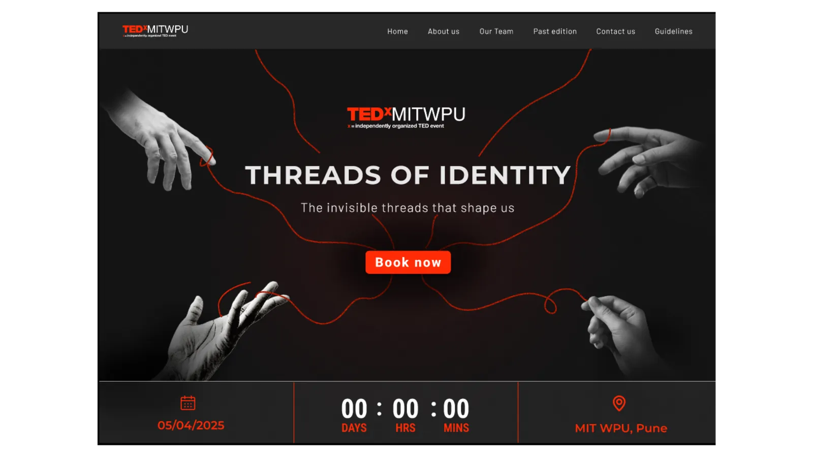
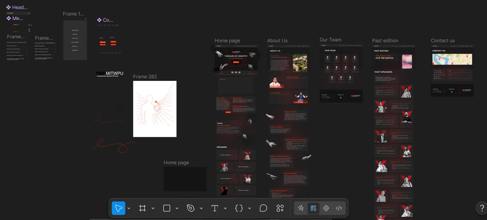
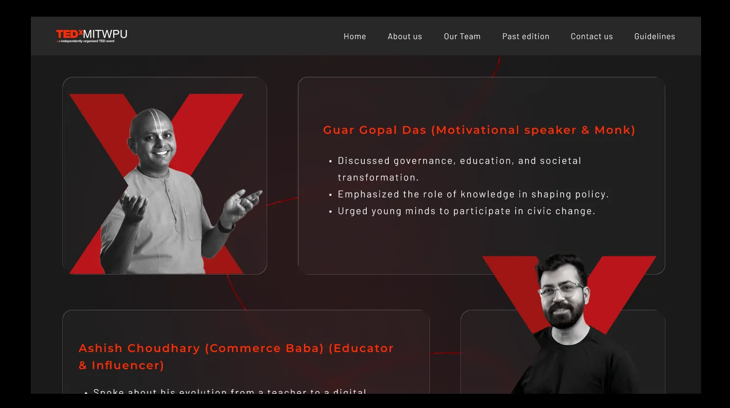
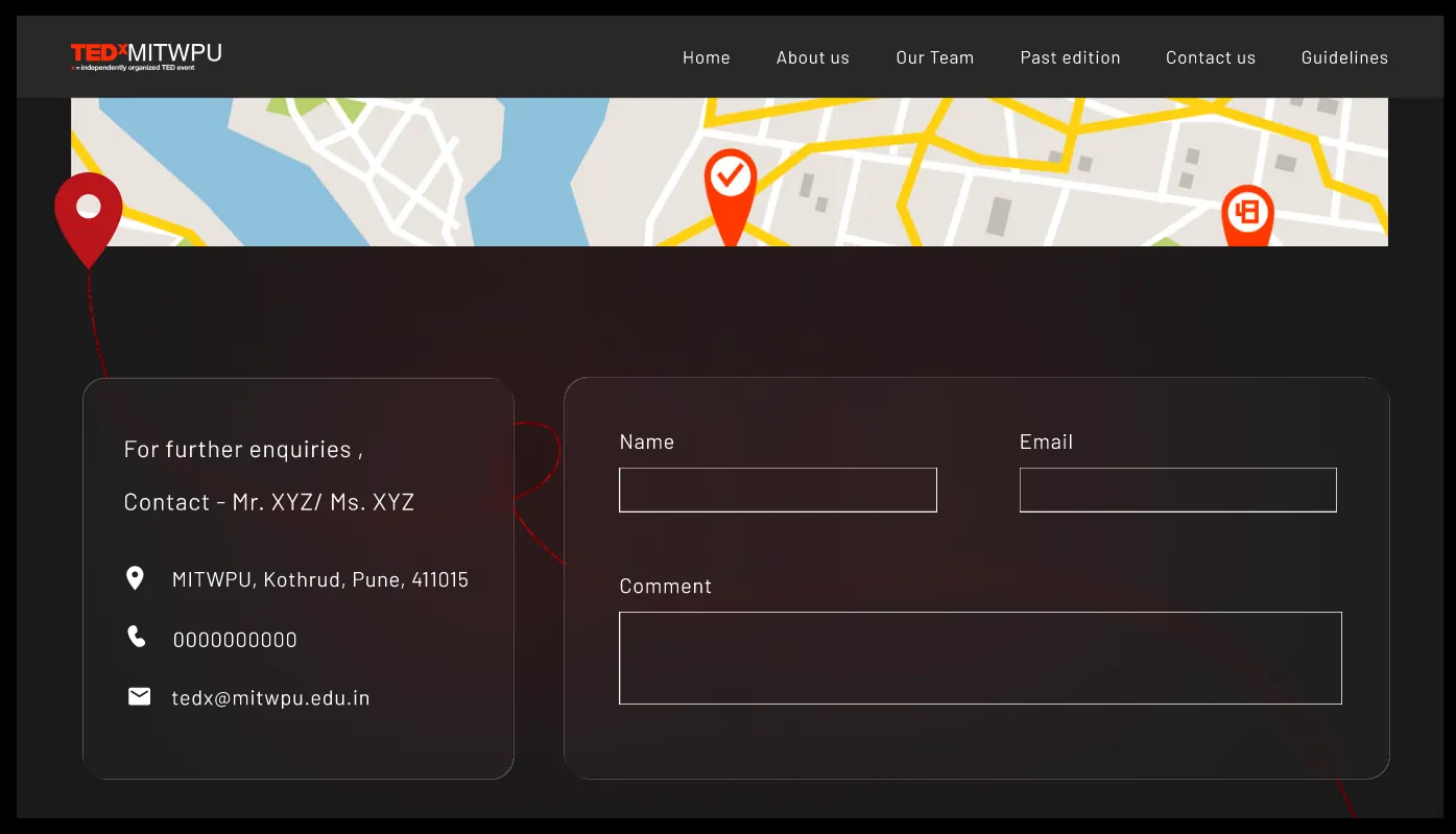
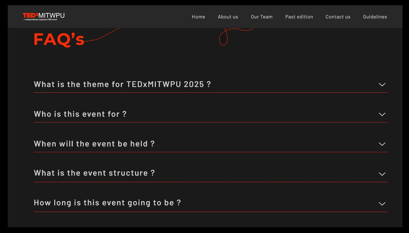
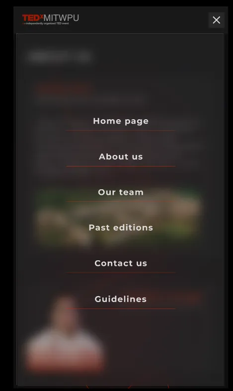
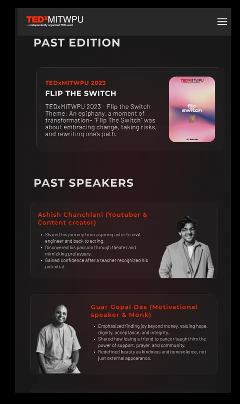
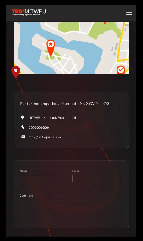
- Website. I set the visual direction and designed the hero and creative elements; my co-designer executed content and layouts across pages. Pages: Home, About, Our Team, Past Edition, Contact, FAQ, plus mobile versions.
- Key decision: countdown in the hero. Registrations had to happen before the event, so a live countdown and the “Book now” button sit on the first screen.
The brand system
The website
Result
The brand identity was used across all event material. The website was built and launched with the design followed on every page except the home hero, which the tech team implemented differently.
Impact
100+ of 192 tickets sold within 72 hours of the website going live, more than half the capacity in three days.
Conclusion
The constraint (three colours, an abstract theme) became the identity. If I did it again, I'd work with developers from the start, so the hero ships exactly as designed.
Next project
Path of Stillness
Narrative iOS game for the Swift Student Challenge 2026.
