Case study · iOS app · 2025–2026
MemorEase: dementia care iOS app
I led UX research and design for MemorEase, an iOS app that gives early-to-moderate dementia patients emotional comfort through reminiscence, and keeps their caregivers in the loop. Midway, we caught that our core feature was hurting the people it was built for, and rebuilt it in a month.
- Role
- UX lead: research, flows, UI; coded parts in UIKit
- Team
- 4, in the MIT-WPU iOS Student Development Program (Apple and Infosys)
- Timeline
- 2025–2026
- Tools
- Figma, Swift, UIKit, Supabase
The problem
People with early-to-moderate dementia live with memory lapses and trouble with everyday cognitive tasks. That leads to stress, anxiety, irritation and low mood, and lowers their quality of life. It also weighs on the family members who care for them around the clock.
Why it matters
One of my teammates watched his grandmother live with dementia, so the team knew these problems first-hand. When we looked at existing apps, most offered only cognitive games, a few had routine reminders behind a paywall, and none focused on the patient's emotional comfort.
Research
We spoke with caregivers, a psychiatrist and neurologists. What we learned shaped every feature:
- Patients follow a fixed daily routine, and missed or doubled medication is a real risk.
- Many get irritated in the evening (sundowning) and have mood swings.
- Their best moments come from familiar, nostalgic things: old songs, singing, people they love.
- In the moderate stage, some wander out of the house, so caregivers need to know what's happening when they're away.
- Doctors stressed that reliving memories matters, not testing them.
Process
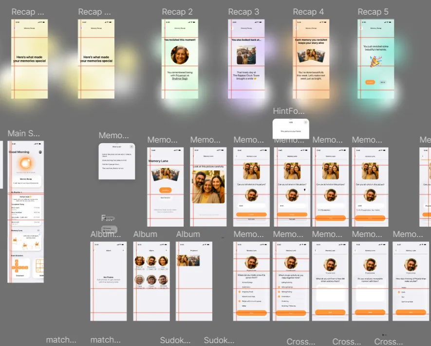
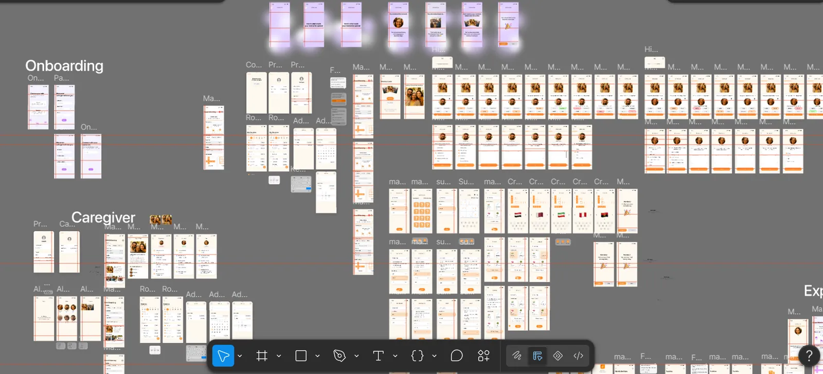
- Low-fi to hi-fi. We sketched flows, then designed in Figma, reviewing each stage with our program mentors and external mentors from Apple and Infosys before coding.
- Two interfaces, one bond. Role-based onboarding: the patient signs up first and gets a connect code; the caregiver uses it to link to the patient's account.
- Designing for users aged 60+. One-to-two-tap navigation everywhere, adjustable text size, high contrast, voice input, and a warm beige palette that feels calm, not clinical.
- Holding design and code together. I checked that the built app matched the Figma designs throughout development, and coded some flows myself.
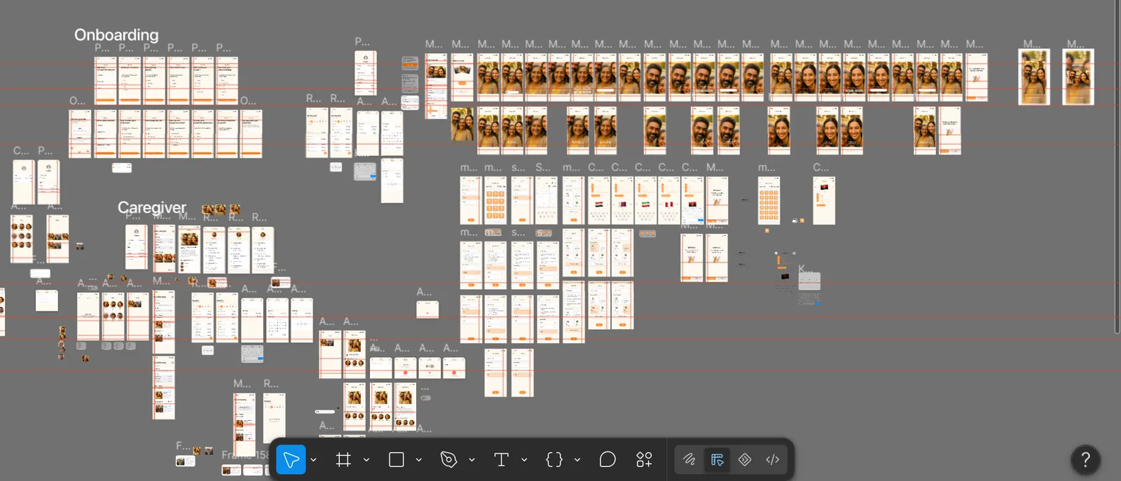
The pivot: from quiz to comfort
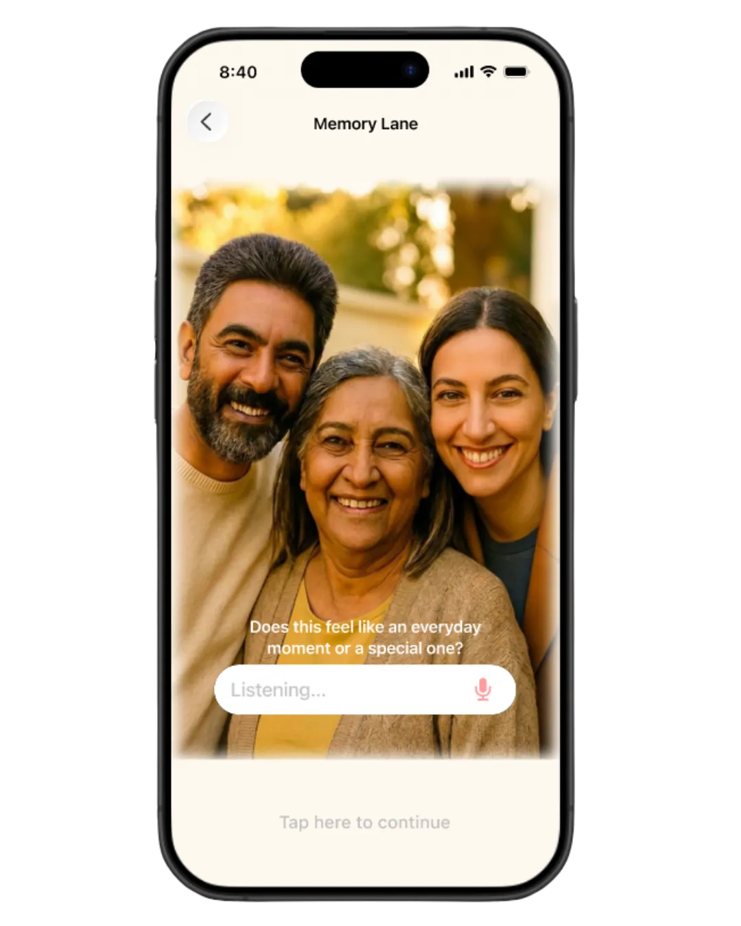
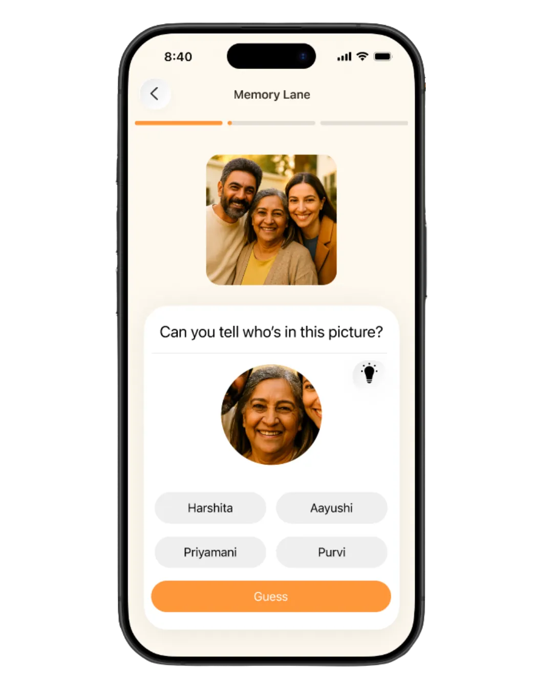
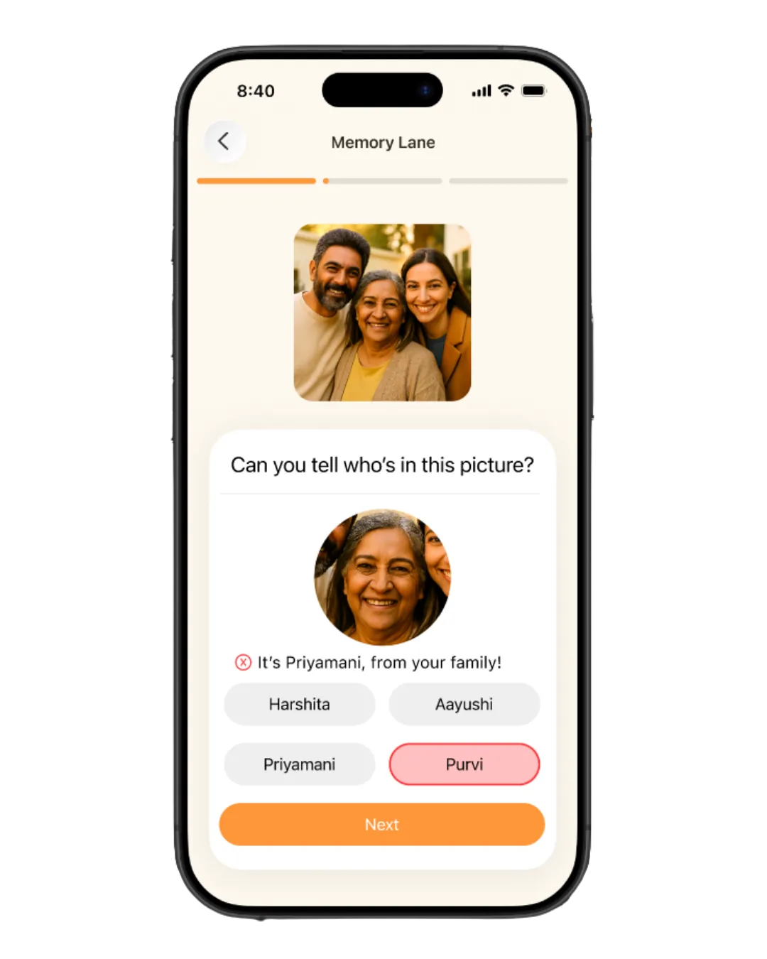
On mentor advice, the first Memory Lane asked patients to recall who was in a photo, with right and wrong answers and corrective feedback. It worked like a quiz. For someone with dementia, that risks a painful message: you can’t remember things you used to. For a large part of development, our main feature was quietly working against the problem we set out to solve.
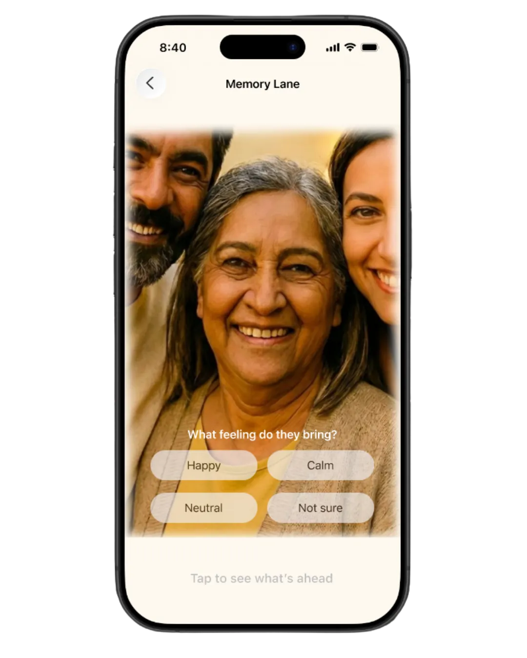
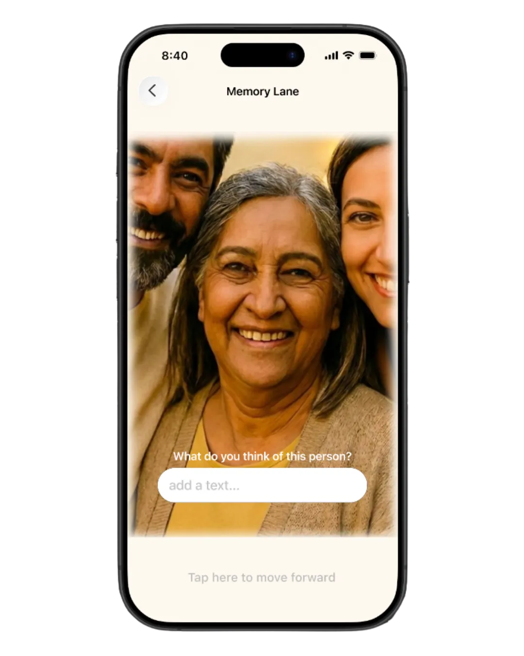
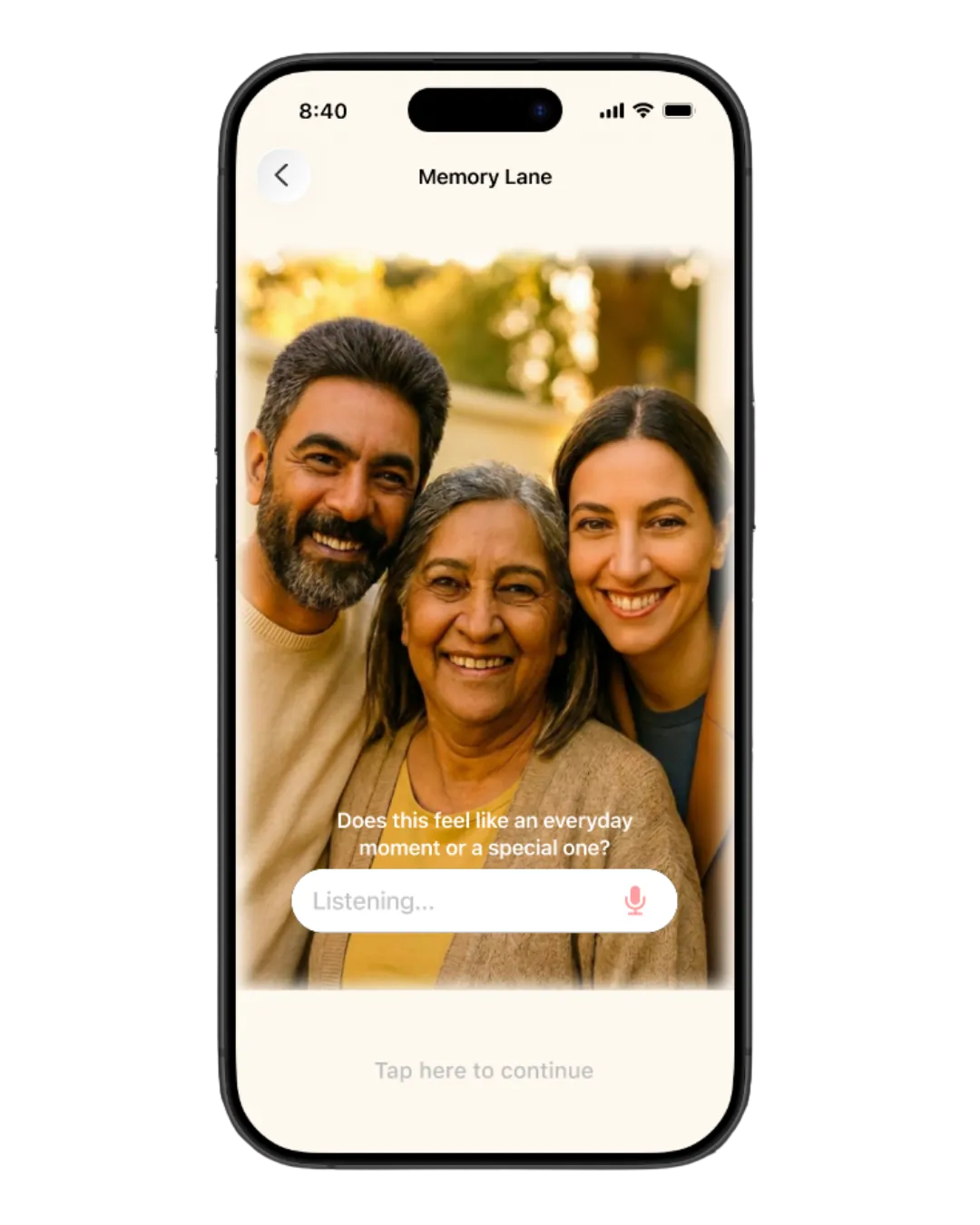
An external mentor review exposed it. Within a month we redesigned the flow from scratch around reminiscence therapy:
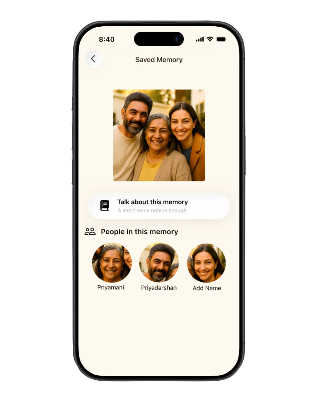
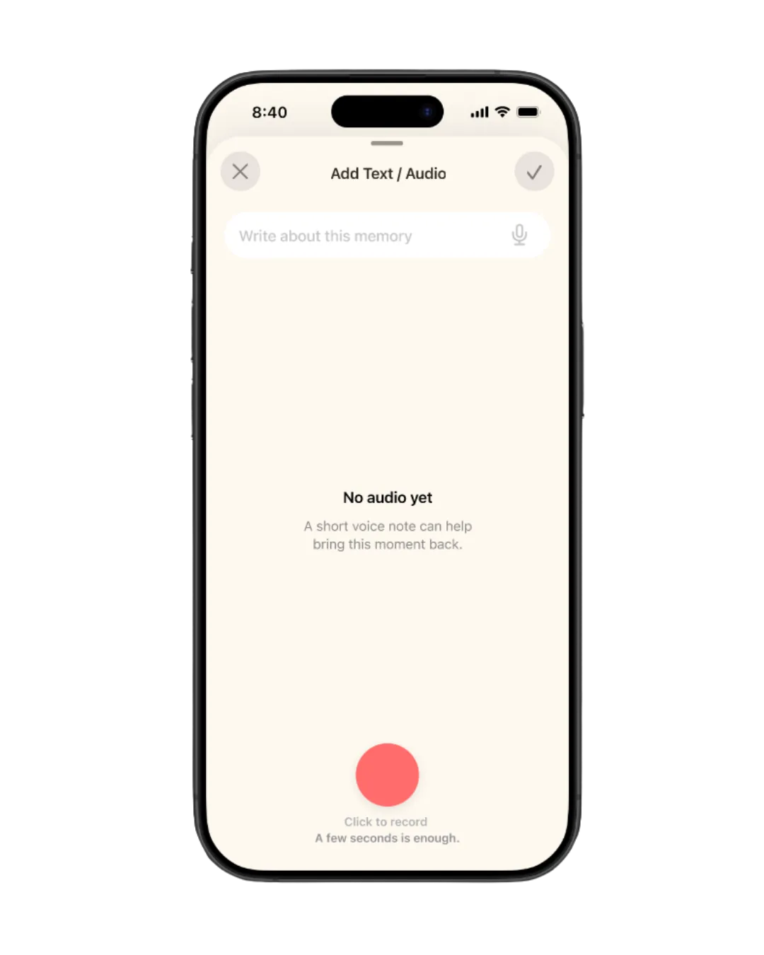
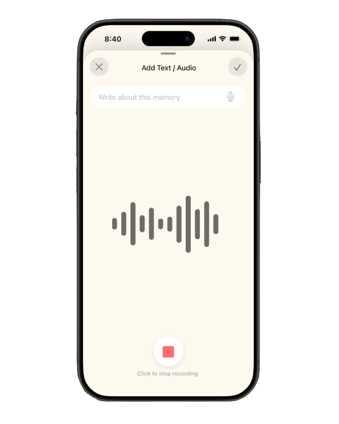
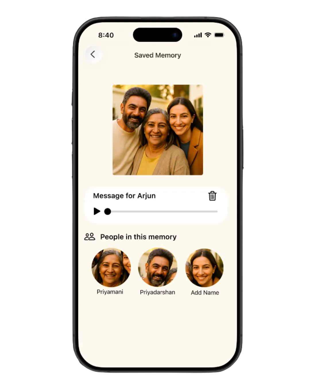
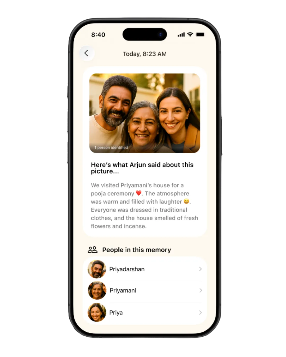
- The caregiver uploads a photo, tags faces, and records or types the story behind it.
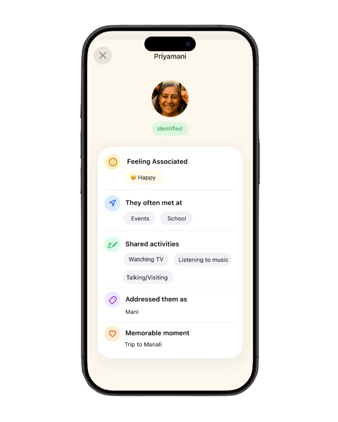
- The patient sees the photo and gentle, open-ended questions: Do you remember this person? (yes / no / maybe), then What did you enjoy doing together?
- Every question is optional and skippable; there are no wrong answers.
- The session ends by asking how the memory made them feel.
Before: the recall quiz
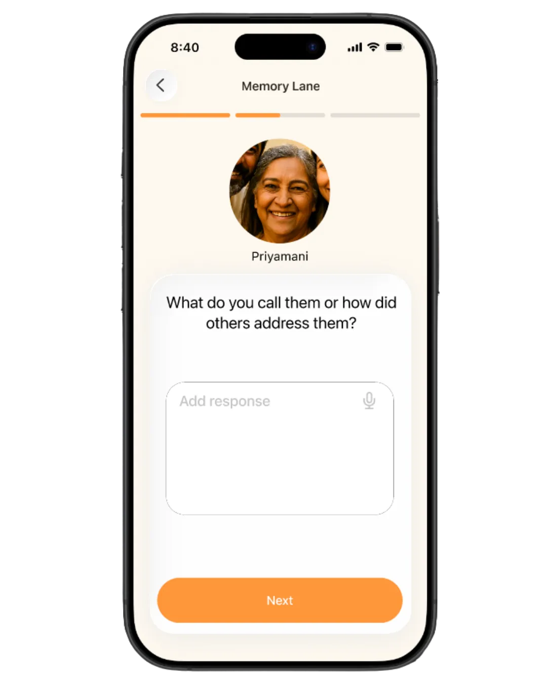
After: the reminiscence flow
Result
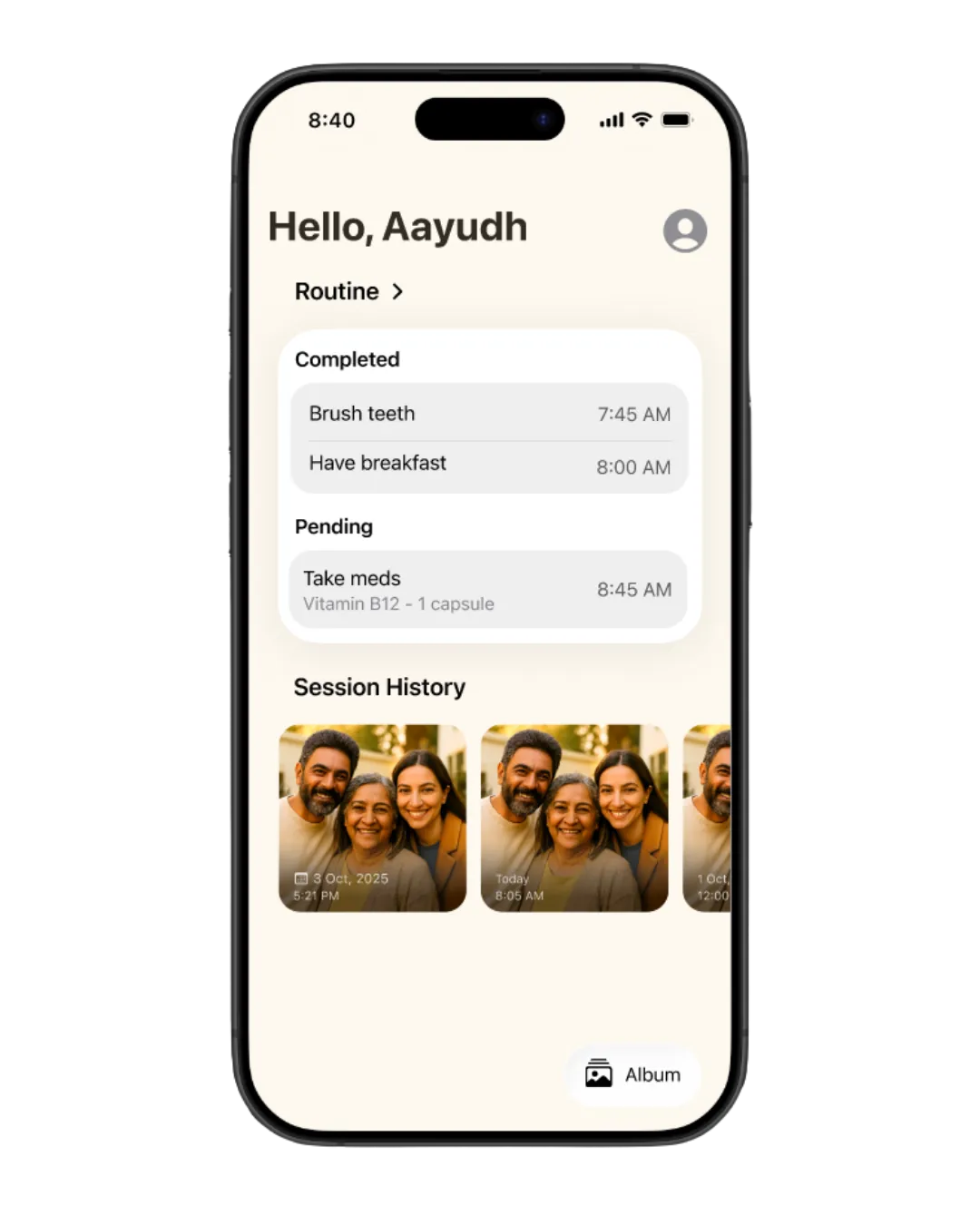
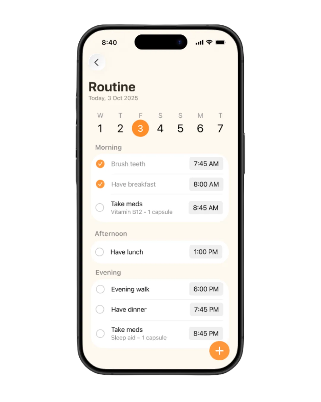
A working, demoed iOS app with three patient features and a caregiver side:
| For the patient | For the caregiver |
|---|---|
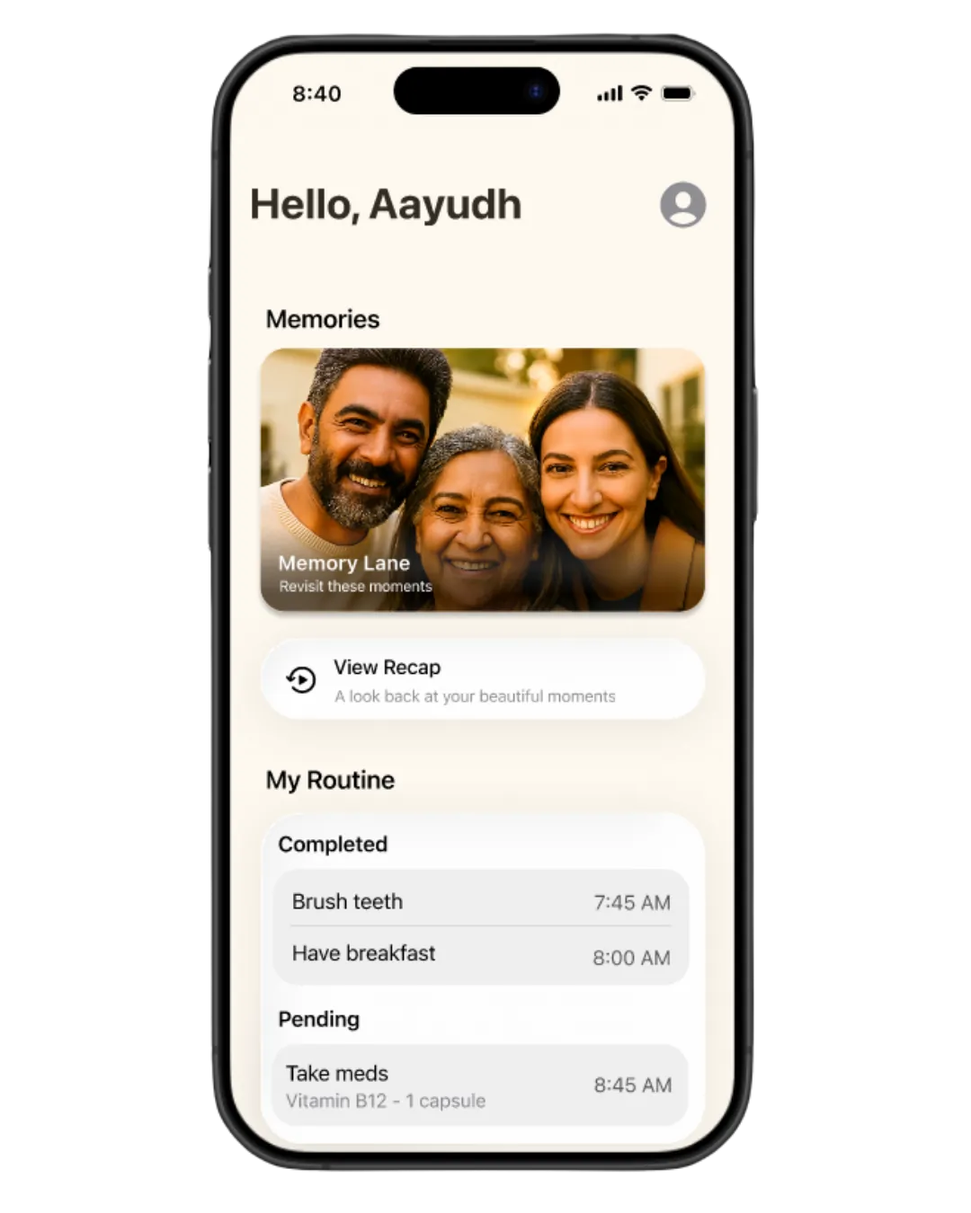
| Memory Lane: reminiscence sessions with photos and gentle questions | Album: upload photos, tag faces, tell the story by voice or text |
| Memory Recap: relive past sessions as a short story-like summary | Session view: see what the patient answered and shared |
| Routine reminders: notifications answerable yes/no without opening the app | Routine setup and tracking: see which tasks were done while away |
| Cognitive games: sudoku, crossword, match the cards |
Impact
The psychiatrist who advised us reviewed the app and said it would help patients. The app was demoed to mentors from Apple and Infosys. App Store release was planned by the college but hasn't happened yet.
Conclusion
The biggest lesson: expert advice still has to be checked against the user's reality. A feature can work technically and still do harm. The next step would be testing with patients and caregivers at a dementia care centre, which the one-year program didn't leave room for.
Next project
TEDxMITWPU
Brand identity and website for “Threads of Identity”.
